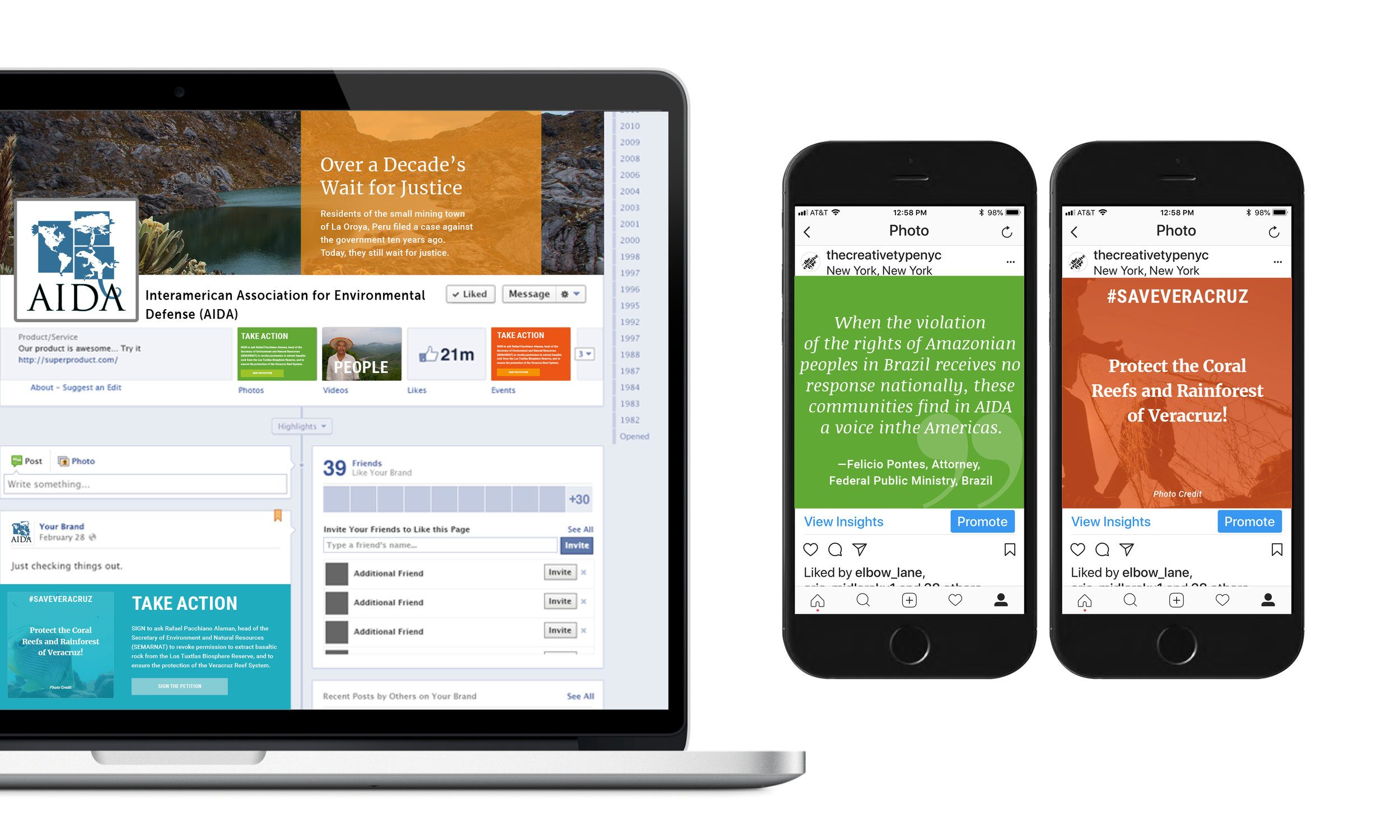
OVERVIEW
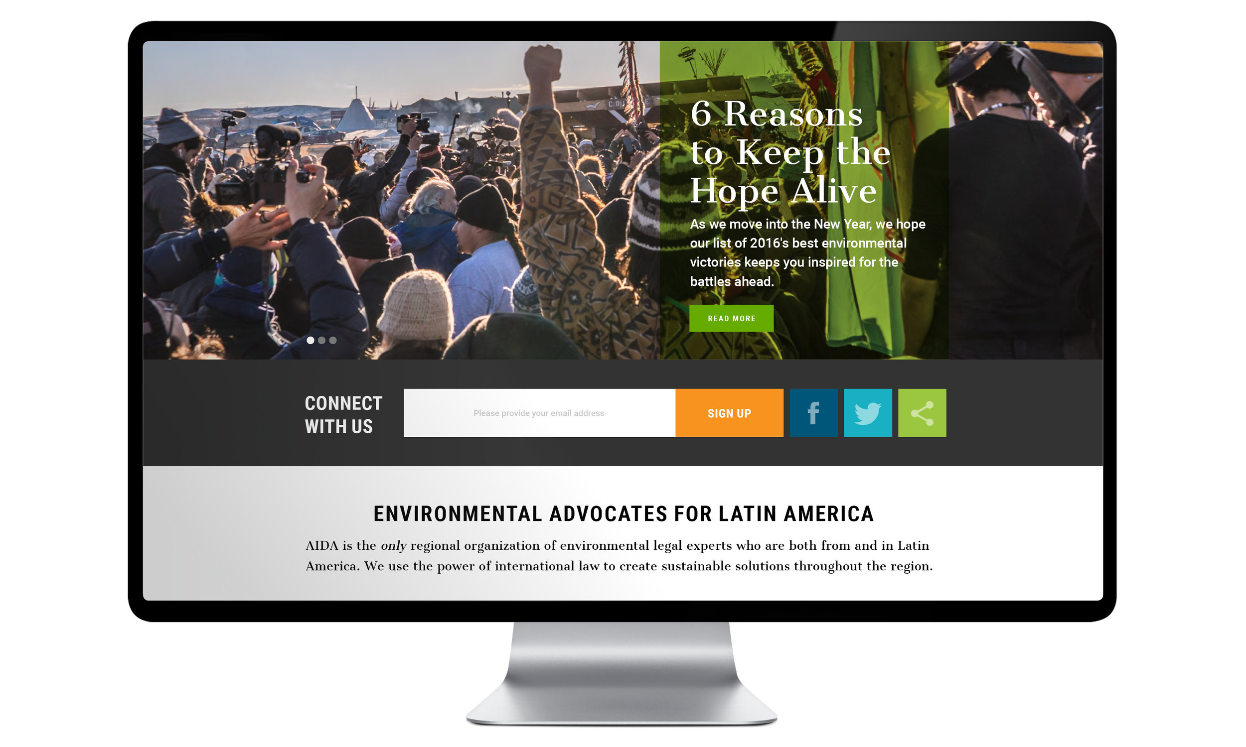
AIDA is a non-profit environmental legal organization that litigates and advocates in partnership with Latin American communities whose water, air, land, climate, and health are threatened or harmed by development projects. We were brought in to help them establish a clear brand identity through a refreshed logo and redesigned website in order to expand and enhance the organization’s fundraising abilities and also their status as an essential resource.
Problem
Keeping in mind the constant need for support from outside organizations and donors, our specific focus was to establish AIDA as an individual organization—as opposed to a network—with succinct messaging that consistently represented the brand and the vision of the organization with clarity, to make clear that AIDA’s work at the national level results in regional benefits and to establish that AIDA improves lives in communities and the legal systems that govern them.
Solution
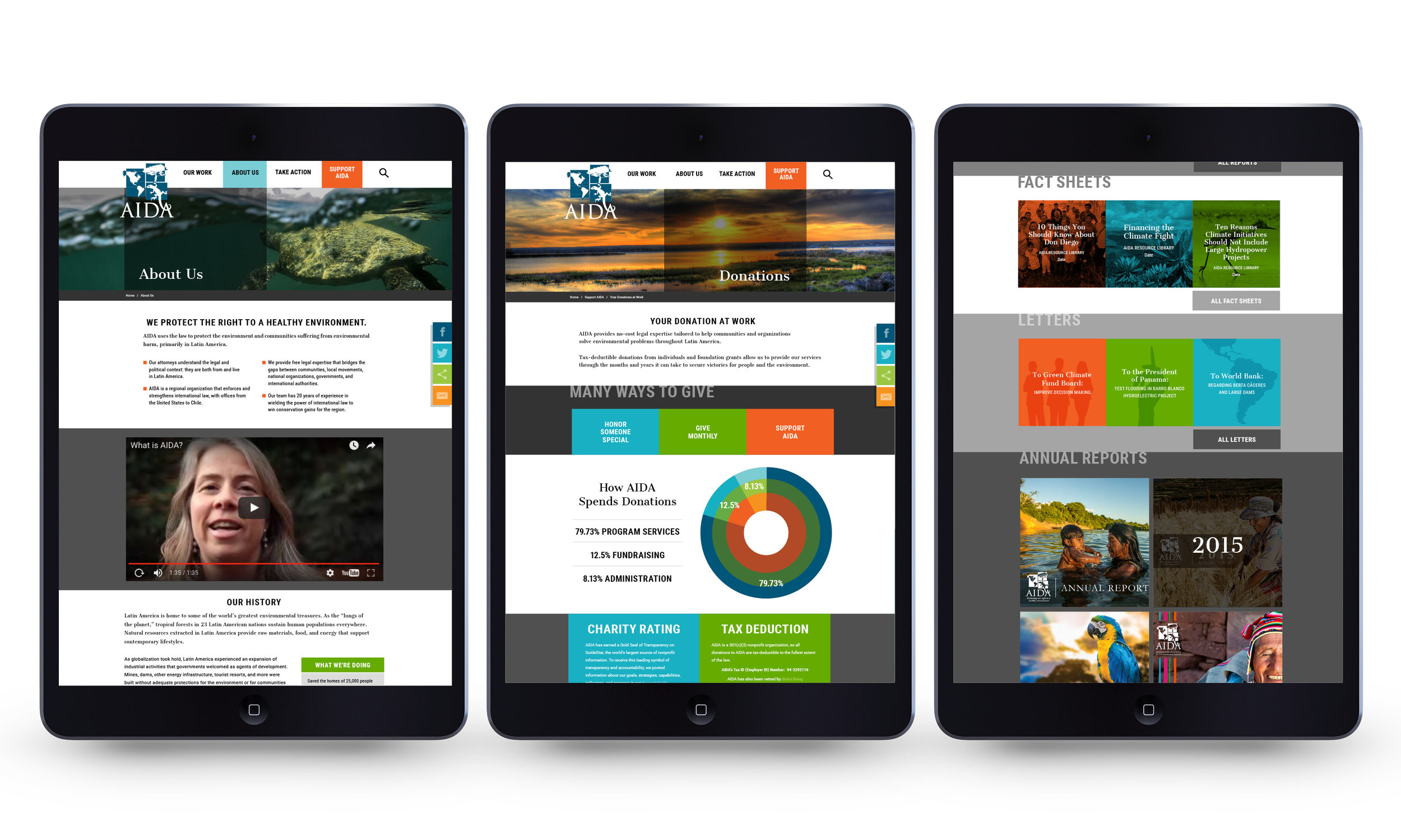
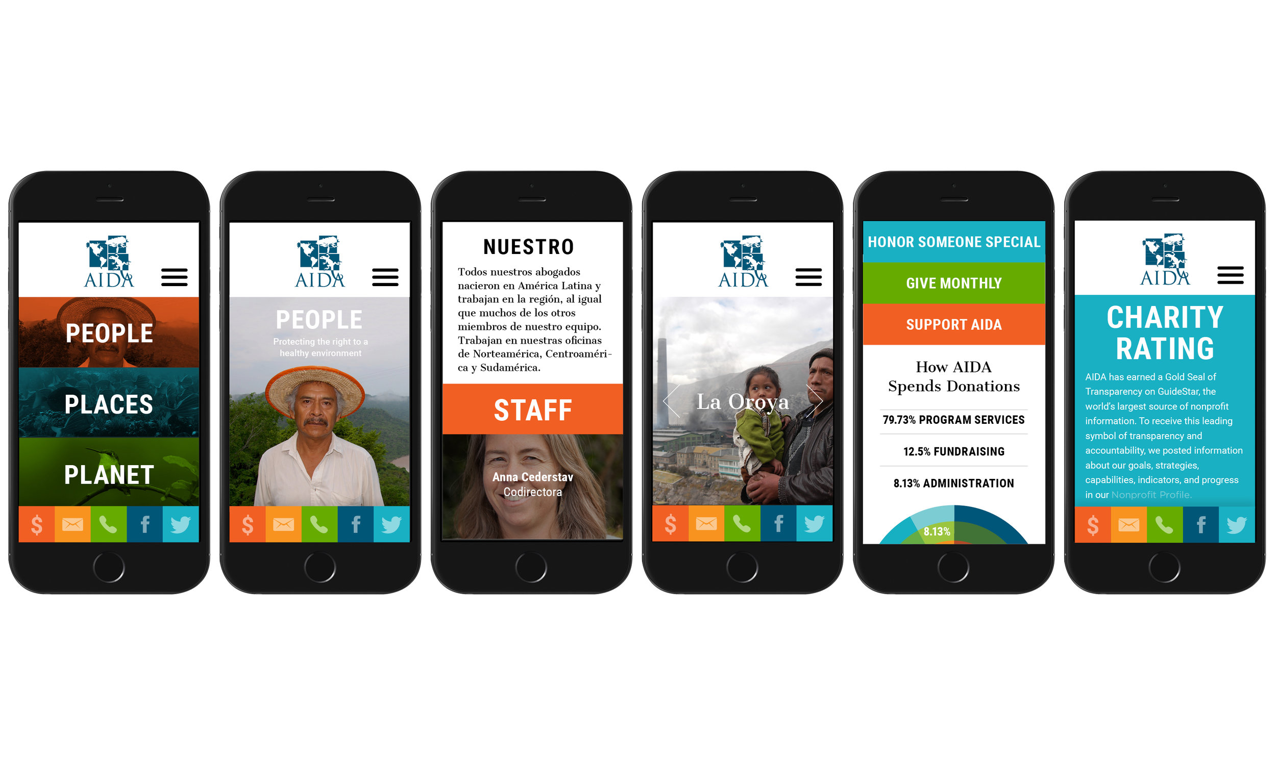
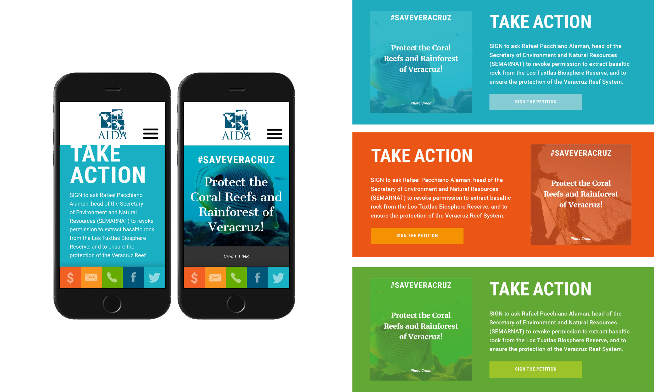
We agreed to establish the visual image of the organization as the legal authority and strategic resource, fighting against injustices to the environment and its people by supporting communities in crisis, demonstrating AIDA’s commitment to change, yet emulating AIDA as caring and approachable, in order to increase AIDA’s brand equity in several ways, a) by retooling the brand and voice so that it clearly and simply conveys the ethos of the organization to its community, b) by expanding exposure and monetary support via a variety of clear Call-to-Action areas on their site which would appeal to all current and future interested parties, and c) to make their vast library of articles and resources more accessible and user-friendly in order to become a go-to source for information as well as increase inbound traffic.
Process
Design all aspects of logo and website while working with their preferred drupal based developer. We worked on several stages of rebranding their logo and website, however, ultimately they decided to stay with their existing logo in an effort to maintain brand recognition. We worked with their developer to create a responsive website with various modules that would be able to handle their vast array of growing content and resources, while also creating a variety of brand assets for future brand expansion.
Intake / Questionnaire
Creative Brief
Logo Design
Wireframing / Outlining Website
Web Design
Editing of Existing Photography Assets
Instructing Developers / Releasing Assets
Results
While AIDA is still in the process of building their new website, independent of our guidance, we provided them with a new brand DNA and collateral assets, templates, and and a basis within which to expand all of their branding and outreach touchpoints.


